The Only E-commerce Web Design Guide You Will Ever Need!
Your website establishes your online presence and feeds bottom-of-the-funnel leads to convert; therefore, it must be well-designed. This thorough tutorial will teach you all you need to know about website design so that you can create a masterpiece that will get a lot of attention.
Did you know that your website's web design accounts for 94% of initial impressions? This demonstrates that your audience's first impression may have a long-term influence on how they perceive your company. If you want to achieve success and profit from your online business, you should seek the advice of an experienced digital strategy agency that can advise you on how to have a better impression on your users, generate leads, and make your entire business lucrative through web design.
Depending on how professionally it is made, a website’s design may make or break your digital presence and lure or drive your prospective audience away. In today's world, when everything is more competitive than ever, and you can't afford to have a bland online presence, it's preferable to start looking for a reputable custom web design firm that can create a great website that entices your customers to click and convert straight away. Alternatively, if you are just starting up and can’t quite afford to hire a bespoke web-design firm, we have some guidelines for you to follow to ensure that your website doesn't stray too far from the mark.
First, ask yourself - what is it?

What Exactly is Web Design?
Website design is the process of gathering ideas, arranging them visually, and putting them into action to create an appealing website. It all comes down to planning, conceiving, and creating your website's overall looks.
Web design is in charge of developing the overall appearance and feel of your website so that when visitors interact with it, they find it interesting. Web design is responsible for the website's look, layout, colour, graphics, fonts, and, in certain situations, content.
Now that we know what it is, what about the why?
Why Do You Need Good Web Design and Why Is It Vital for Your Business?
People are now quicker to jump the gun and levy judgments in today's fast-paced environment. When it takes just 50 milliseconds (0.05 seconds) for people to create an opinion about your website, it is more important than ever for your company to have a strong website design to retain your potential audience's attention within 50 milliseconds.

Furthermore, a good website design serves as your company's first impression, having a good design increases trust and brand consistency, improves usability, simplifies navigation, supports your SEO strategy, streamlines loading speeds, decreases bounce rates, increases conversions, and, most crucially, converts your visitors into customers.
At this point, you might be saying - alright, the theory portion is all nice and well, but how do we put this into practice?
We’re glad you said that because our next portion is about the basics of effective website design!
Effective Website Design Foundations
A website that appears fantastic but performs poorly when your users visit it is a no-go. So, what constitutes a good website design that is both aesthetically beautiful and functional? Let's look at the fundamental principles of web design that contribute to its usability and effectiveness.
1. KISS
“Keep It Super Simple”! Those of you who have read our copywriting article, which can be found here, will recognise this one as a rule from copywriting. However, don’t scoff at it as it is also one that makes the basis of good design.
We can’t deny that the nicest things in life are the simplest. When it comes to user experience and website usability, simplicity is the best way to go. The design may accomplish simplicity by stressing clarity and whitespace. To make your UI appealing to your visitors, keep it basic, easy to use, and clean.
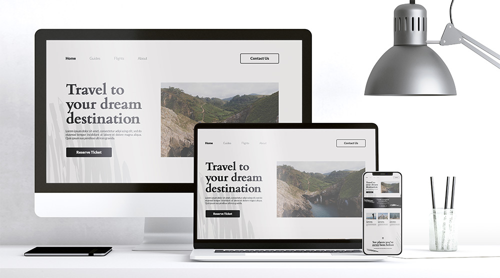
Bonus tip: Ask people who are ardent Apple fans about why they like using iOS and you’ll more often than not come across the words “Their UI is clean and simple”.
2. Purpose
Having a clean and simple design is good, but you gotta have some reason behind having your website instead of just showcasing awesome designs. Begin by asking yourself, "What is the aim of my website?" Is it meeting the requirements of my users? Every website serves a particular function, so after you've determined yours, you'll have a better idea of what your website design should look like, and you'll be able to execute it properly to meet the specific demand of your website viewers.
3. Communicate Content
Adding on to the issue of shortened attention spans, it’s no secret that these days’ Gen-Z wants information as soon as possible, which is why your website must communicate (visually) effectively. Make sure your material is easy to read and understand for your visitors. When it comes to successful web design methods, it is possible to arrange content using heads and subheads, bullet points, and much more.
An excellent site design incorporates both good design and good content. You must use online content to express your brand message engagingly. When generating web content, using persuasive language may attract and influence visitors, transforming them into committed clients.
4. Usability & Scalability
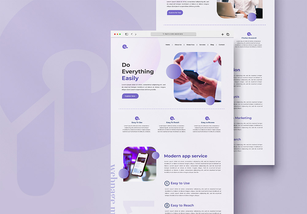
Even if your website has a trendy design, it is useless if it is difficult to use. One of the most important characteristics of excellent web design is usability. Prototypes are the best and most cost-effective technique to test for usability concerns. Once you've ensured that your usability is top-notch, your website will perform properly and be simple to use.
People are becoming increasingly reliant on mobile phones. Websites may now be accessed from a variety of devices with varying screen sizes. As a result, it is critical to consider developing your website with a responsive style, which allows your website to seamlessly adjust to mobile phone displays and various display sizes.
That was our coverage of the BASICS that we believe to be the cornerstones of good website design. The next portion of this article will add more detail to the foundation we’ve already built.
Detailed Tips For Website Design
Without further ado, let’s get right into our tips to get your shop's e-commerce web design to the next level!
✧ Simplicity
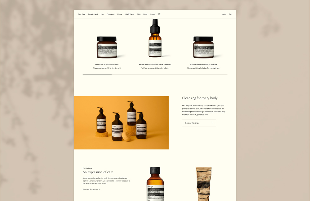
This is one that we can’t over-stress. One of the most important things to remember during the e-commerce design process is something we mentioned before - "KISS" (Keep It Super Simple).
When it comes to developing an e-commerce website, less is more. The more components you have on the page (colours! banner ads! the better, ALL THE POP-UPS! ), the more it detracts from the main purpose of the website—closing a deal.
You don't need a lot of bells and whistles on your e-commerce website; they just serve as a distraction. Maintain a clear, clean, and basic design while focusing on the sale.
✧ Priority Branding
When it comes to online purchasing, people prefer to buy from well-known companies rather than nameless e-commerce sites that appear to be a ruse to steal their credit card information.
If you want to develop the trust necessary to drive substantial sales with your e-commerce firm, you must give your branding some serious attention. Your branding is similar to the DNA of your e-commerce business; it represents who you are as a company, what you stand for, and how you vary from your competitors—and it plays a significant role in connecting with your audience and generating sales.
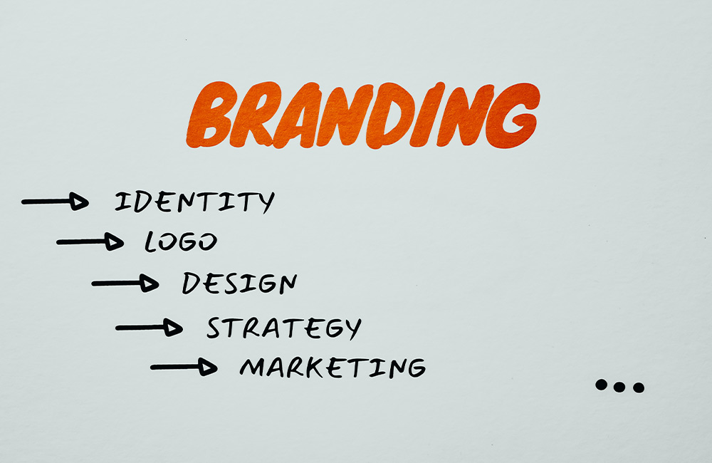
Take the time to identify your brand before infusing it into your e-commerce design if you want to get the most out of it. It's okay if you're not sure who you are as a brand. You'll only need to perform some business soul-searching before you start developing. Consider the following:
✣ Who would my brand be if it were a person?
✣ What three words would I use to define my brand if I had to?
✣ What distinguishes my brand from other e-commerce stores?
✣ What distinguishes us from the competition?
Those last two questions might be familiar to you if you’ve read our USP article. If you haven’t already read that one, then feel free to do so here! Also, this tip revolves around the topic of branding which we also have an article about, here.
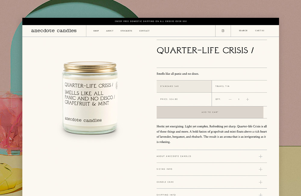
Once you've determined who you are, you can include that into the branding of your ecommerce site. And what about the branding? It will help you create trust with your audience while also driving substantial purchases.
✧ Think Like A Reader
If you want your ecommerce website design to connect with your target audience, you must think like them. Finally, there are just a few things your potential consumers look for in an ecommerce experience: a site that is easy to use, well-designed, and makes the purchase process simple, uncomplicated, and painless.
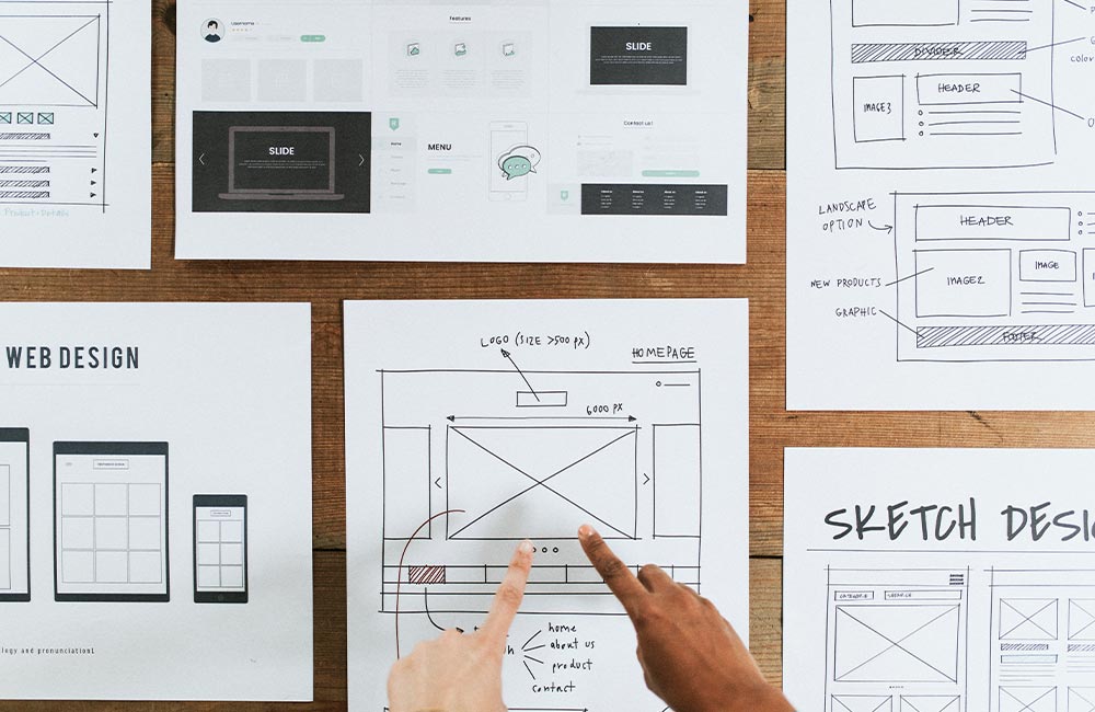
And if you want your ecommerce store to flourish, you should provide them with such items.
Put yourself in the shoes of your visitors during the design process. What type of layout will make it simplest for them to navigate? How can you structure your items such that the end consumer can understand them? How can you make the checkout process easier?
Think like your consumer to predict what they want from your ecommerce business and then build your site to satisfy those demands.
✧ Add A Splash Of Colour
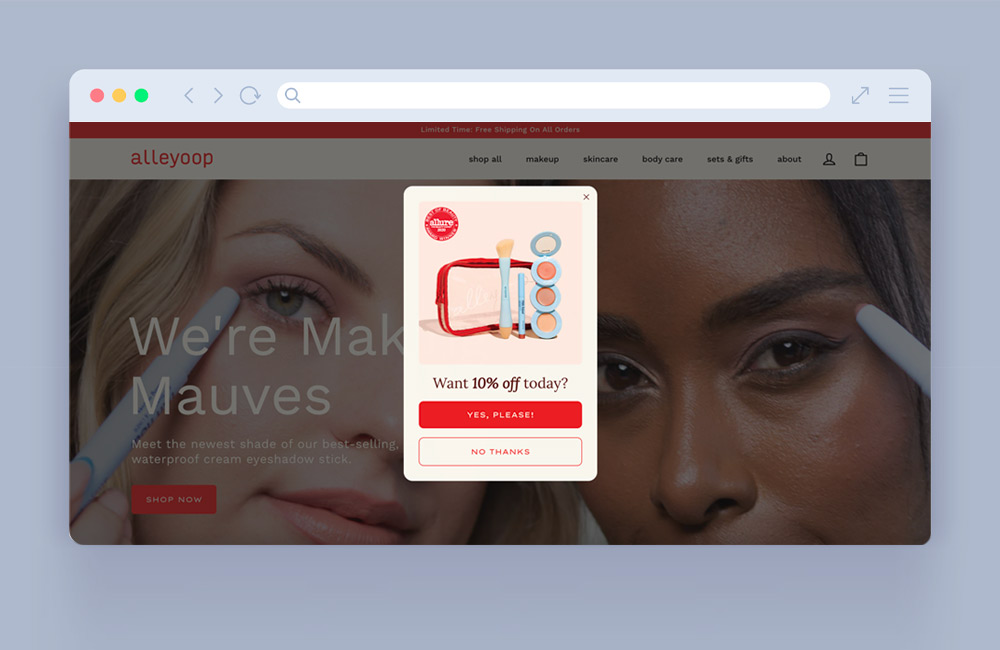
Choosing colours for your e-commerce site is more than simply declaring, "Well, red is my favourite colour, so...make let's everything red!" Colour is a really strong weapon, and if you understand its psychology, you can utilise it to your benefit (and drive some serious sales in the process).
Different colours may evoke various sentiments, emotions, and behaviours in individuals; thus, if you want your e-commerce site to convert, you must capitalise on those colour inspirations.
For example, if you want them to buy something, make the purchase button stand out by using a bold colour such as red. According to colour psychology, red evokes sentiments of excitement and passion, which are motivators for spending—and studies suggest that tinting a button red may improve conversions by a staggering 34%.
Alternatively, if you want to increase your reputation, add blue into your web design. Blue is not just a globally popular hue, but it has also been proved to promote emotions of trust, making it a popular choice in the corporate sector (there's a reason blue appears in more than half of all logos).
The point is that colour is one of the most powerful elements in your design toolkit, and if used correctly, it can have a significant influence on your e-commerce design.
✧ High-Res Pictures
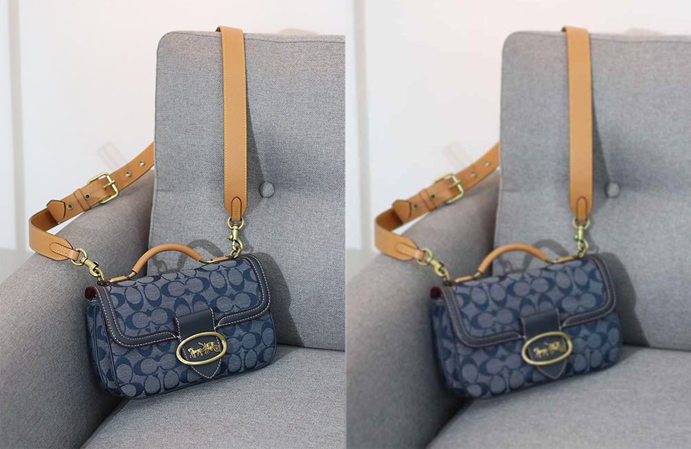
It is common knowledge in the world of web design that images increase conversions (for example, one recent case study showed that incorporating more relevant images into a website design increased conversions by over 40%). This is especially true in the case of e-commerce.
Nobody is going to buy anything they haven't seen. If you want customers to buy your items, you must show them what they're getting with high-quality product photographs.
Having quality photos of all your items (and images of your products from several perspectives) goes a long way toward instilling confidence and trust in your consumers. They are more inclined to buy if they are convinced that they know what they are doing. However, if there are no photographs of the goods they want to buy (or only a single, low-quality image), they will be more hesitant to purchase—and your conversions will suffer as a result.
Make sure you have a lot of high-quality photographs of anything you're offering on your e-commerce site. Your conversions (customers) will appreciate it. Also, make use of a white background. The background for product photographs should not be distracting or contradictory to the product itself. A white background is ideal since it makes the goods stand out and goes with practically any design or colour palette.
Should you feel that pictures are too old-fashioned, videos have the capacity to convey a large quantity of information in a short period. Use a movie to demonstrate how the product works and to offer as much functional information as feasible.
✧ Readable At A Glance
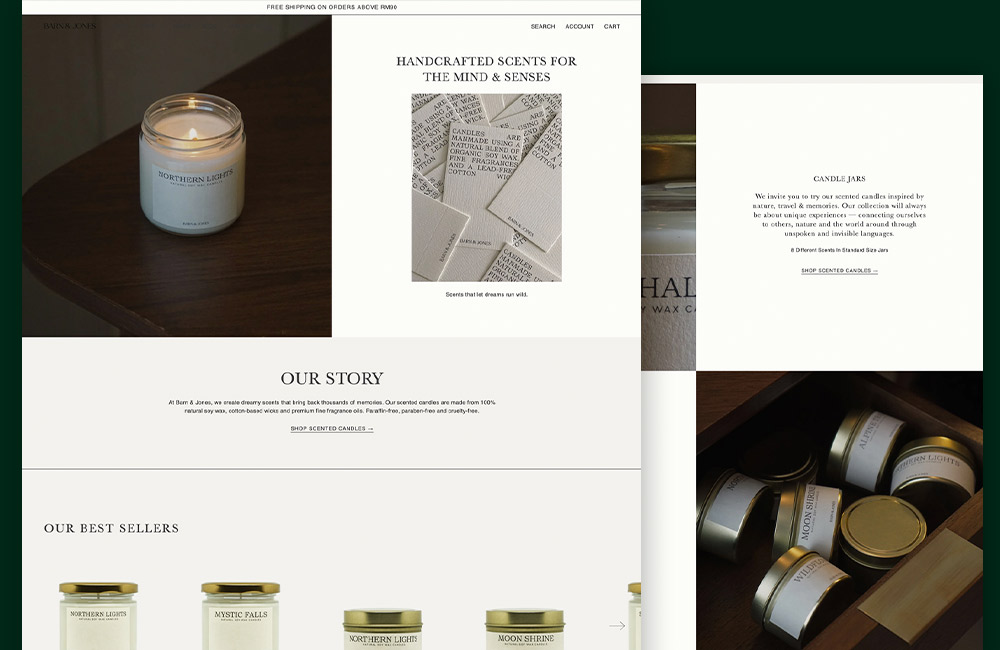
You can spend days developing detailed descriptions for your e-commerce site's items, but we have bad news: no one will read them.
According to research, most internet users only read roughly 20% of the material on any particular online page. Instead of reading material word for word, people just scan the text for crucial information—so, if you want to get your message through (and drive sales), make your content scannable.
Divide your material into scannable chunks, whether it's product descriptions, blog pieces, or an "about us" page. Keep sentences and paragraphs brief, use bold to highlight important information, and use bulleted lists to break up long blocks of material.
The easier it is for your audience to scan your information, the more likely they will grasp your important messaging—and the more likely you will be able to close a deal.
✧ Look Professional
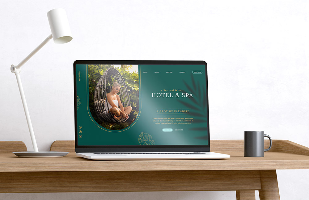
The foundation of an e-commerce site is that you invite your website users to buy something from you. As a result, you're requesting sensitive information from them, such as their credit card information. Which they will not feel comfortable doing if your website does not appear professional.
Investing in a quality website is essential if you want to generate trust with your customers—and creating trust is essential if you want your e-commerce business to flourish.
What exactly do we mean by "professional"? There should be no mistakes or misspellings on your website. From page to page, your typeface, colour palette, and footer design should be consistent. All of your product links and buttons should function properly. Your photographs shouldn't appear like they were taken with an outdated iPhone 5, and your whole site design shouldn't look like it was lifted from Geocities in 1997.
The point is that if you want your clients to take you seriously, you must demonstrate that you take yourself seriously—and the only way to do so is through professional site design.
✧ Persuasive & Trusted
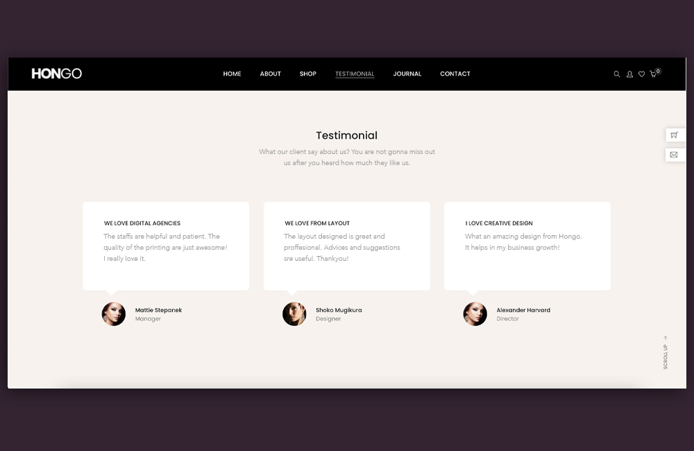
Another approach to foster that all-important trust? Social evidence.
Look for methods to display to your future consumers the good comments you've received from your existing customers while developing your e-commerce site. Include a rating section where customers may rank your stuff (and then get as many 5-star reviews as you can). Add a testimonials area with customer images and a comment or two about how much fun they had working with you. Customers may evaluate your items and tell you what they like about them, which you can subsequently post on your blog.
The more visitors to your website discover that other people have had a pleasant experience purchasing on your site (whether through reviews or testimonials), the more trustworthy you'll appear—and the higher your conversions will be as a consequence.
Companies are also increasingly turning to advanced psychological research to generate greater engagement and transactions, transforming what was once an art into a science. Persuasive design in eCommerce is a powerful tool for increasing sales.
Displaying related goods that consumers might be interested in that complement the present offering or things that others have purchased. This may be shown on a product detail page or in the shopping cart to assist lead buyers to the items that fit their needs, thereby encouraging them to continue shopping—a wonderful method to cross-sell related products. Fun fact, we have an entire article dedicated to cross-selling here.
✧ Easy Navigation
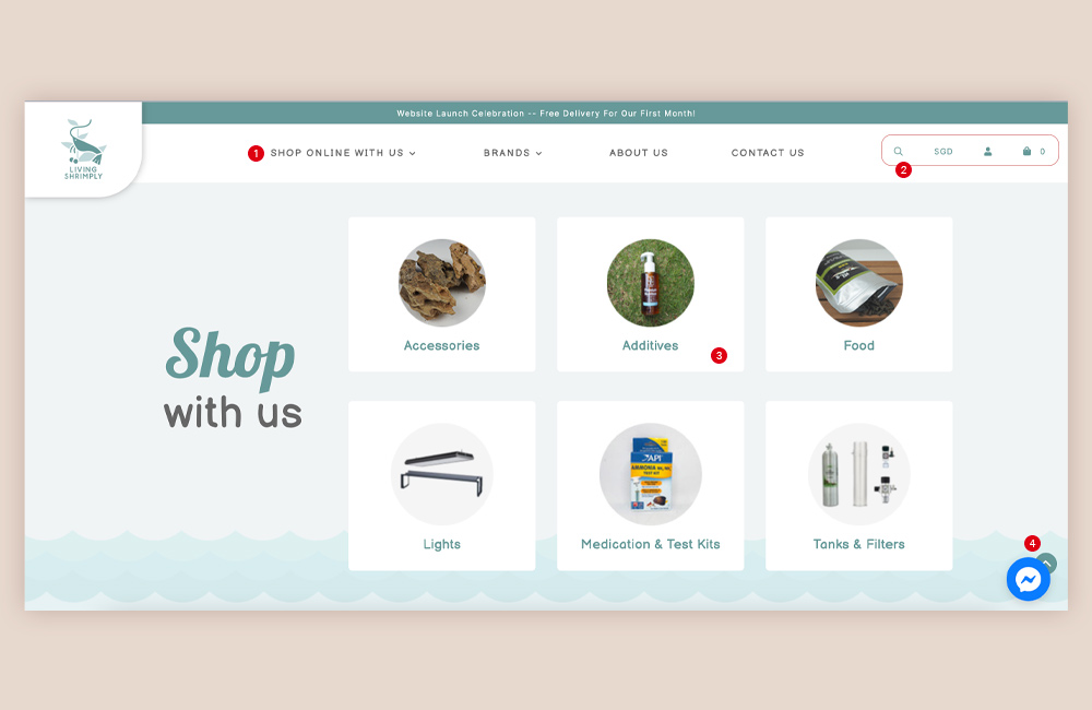
Nothing, we repeat, nothing can kill a sale faster than clumsy product pages. If your website visitors have to navigate through ten different menus before finding the thing they're searching for, they'll leave quickly—and go directly to a competitor's site.
Make your product categories and product pages simple to use. Make it simple for your consumers to search for items and filter them by attributes such as colour, size, or product category. The easier you make it for your consumers to traverse your categories and pages, the easier it will be for them to discover what they're searching for—and the easier it will be for them to make a purchase.
✧ Breezy Checkout
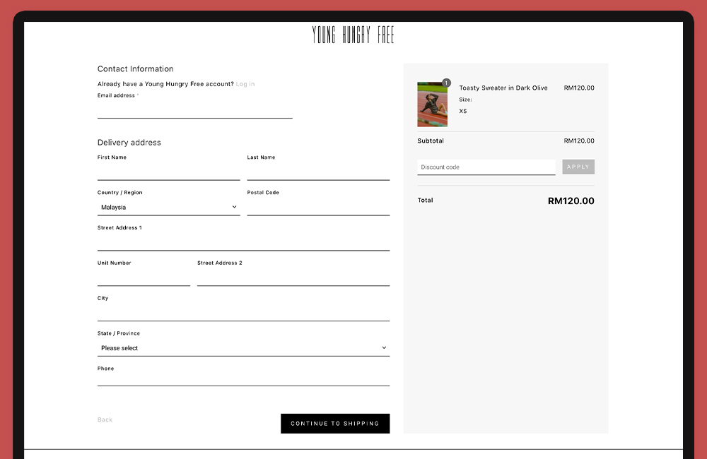
Remember how we claimed that clumsy product pages hurt sales quicker than anything else? A clumsy checkout, on the other hand, comes in a close second.
Customers will leave if your checkout procedure is a hassle in the you-know-what. If you want customers to buy from you, you should make the purchasing experience as easy, straightforward, and painless as possible.
Maintain a clean, basic, and easy-to-navigate checkout page design. Allow your consumers to register for your site or check out as a guest. Make it clear what information you need to process the transaction (and where they need to submit it), the numerous shipping choices available (and how much they cost), and what to do if there is a problem with their order or they need to return it. Once the transaction is complete, lead your consumers to a confirmation page to ensure that everything went smoothly.
In a word, make the checkout process as simple as possible if you want customers to buy from you.
The checkout button should be the primary call to action on the shopping cart page. Make the checkout button prominent, straightforward, and quick to use by using bright colours, plenty of clickable locations, and plain text.
When a product is put in the shopping basket, it should be confirmed instantly and explicitly. Inadequate feedback, such as providing inconspicuous confirmation text, confuses customers. Using animations is a wonderful idea since movement draws the human eye.
It might also be a good idea to use a tiny cart widget. As consumers may add things to their basket without leaving the page they're on, it also enables them to explore, find, and add other goods. Mini cart widgets should always direct visitors to the full-page shopping cart in the end.
Finally, unexpected shipping prices are one of the most common causes for customers abandoning their shopping carts. Include shipping alternatives and taxes, as well as a cost estimate and an approximate delivery date.
Closing Words
Online buyers, in general, want seamless experiences (much like how seamless it is with our Shopcada e-commerce solution). It is not just about developing a website when designing an eCommerce site, but also about providing an online buying experience that will convert passive shoppers into paying customers.
Hopefully, this eCommerce website design guide can assist you in making critical design decisions to create outstanding eCommerce UX that is professional, appealing, user-friendly, and keeps customers coming back more time and time again. Because of the rapid expansion and relatively low market share, there is still a huge possibility for new entrants to overtake incumbent industry giants.

